



Most social reports die in the third slide. Somewhere between the impressions chart and the platform-by-platform breakdown, the VP scrolling on their phone decides this isn't worth reading and moves on. The report you spent four hours building becomes a file nobody opens twice.
The fix isn't a prettier dashboard. It's a social media executive one-pager that leads with a story instead of a data dump — one page, built around a narrative arc rather than a spreadsheet export.
This post is about that specific problem: how to compress a month of social performance into a single page that a busy executive reads in under 90 seconds and walks away with the right conclusion.
Why standard social reports fail the executive test
The typical monthly report is organized the way the analyst thinks, not the way the reader thinks. It goes channel by channel, metric by metric, because that's the order the data comes out of the tools.
Executives don't think in channels. They think in questions:
-
Are we growing or not?
-
Is anything on fire?
-
Where should I put more money next month?
When your report answers those questions on page four, buried under engagement rate breakdowns for each platform, you've already lost them. The person reading has formed an impression — usually a vague, slightly negative one, because vague reports read as "nothing important happened."
There's a pattern worth naming here. Reports that list everything signal that the author couldn't decide what mattered. Reports that lead with three numbers and a sentence signal confidence. Executives trust the second kind more, even before they check the math.
Start with the audience, not the metrics
The single biggest mistake in one-pagers is picking metrics before picking a reader. A one-pager for the CFO and a one-pager for the CMO should share maybe 30% of their content.
Stop managing your social media the hard way.
Postyly helps you plan, schedule, and analyze every post with precision.
- Multi-platform scheduling
- Real-time engagement tracking
- Automated performance reports
No credit card required
Here's a rough breakdown of what each audience actually cares about at the top of the page:
| Reader | Top-line metric they want | Secondary metric | What they'll ignore |
|---|---|---|---|
| CEO / Founder | Revenue-attributable pipeline from social | Audience growth trend | Post-level engagement rates |
| CFO | Cost per acquisition, spend efficiency | Paid vs. organic split | Reach, impressions |
| CMO | Share of voice, funnel movement | Content-type performance | Follower counts in isolation |
| Head of Sales | Qualified leads / DMs / demo requests | Response time on inbound | Reach, saves, shares |
Notice the "ignore" column. That's the part most people skip. Every metric you don't put on the page is a decision, and it's often more important than what you include. A CFO who sees "impressions: 2.4M" at the top of a one-pager immediately downgrades the whole report, because that number has no bearing on anything they manage.
If you've already built a solid measurement structure — like the one in our funnel-to-metric matrix for measuring social impact across the funnel — the one-pager becomes the top layer sitting above it. You're not re-deriving metrics. You're choosing which two or three to surface.
The three narrative slices
Every good one-pager tells one of three stories. Not all three at once — one dominant story, with the other two as supporting context. Trying to tell all three equally is how you end up with the four-slide report nobody reads.
1. The growth narrative
This is the default when things are going well. The arc is: we're up, here's why, here's what we'll do to keep it going.
The trap: growth narratives sound like bragging when they're all numbers. The version that lands includes the mechanism. "Reach grew 18% because we shifted three posting slots to short-form video, which is now driving 60% of new followers" is a growth narrative. "Reach grew 18%" is a stat that just invites the question "so what?"
2. The risk narrative
Used when something is trending badly. The arc is: here's what's slipping, here's how bad it is, here's the plan and what we need from you.
Most social managers avoid this one out of fear. That's backwards. Executives trust people who surface risk early far more than people who only report wins. A risk one-pager that says "engagement on our core audience dropped 22% over six weeks, we think it's algorithm-related, and we're testing two formats to recover" is a career-builder, not a confession.
The key: a risk slice must always end with an action. Risk without a plan reads as panic. Risk with a plan reads as competence.
3. The opportunity narrative
Used when you spot something worth investing in. The arc is: here's a signal, here's the potential size, here's what it costs to test.
A typical example: a single organic post about a niche use case pulled 4x your normal saves and generated a handful of unprompted DMs asking to buy. That's an opportunity slice. The narrative is "small signal, big potential, cheap to test" — and it should include the specific ask, like "we'd move roughly $2k of next month's spend to test this angle in paid."
This is also where the content prioritization thinking from our evergreen scoring rubric pays off — you're not guessing which signal to chase, you're surfacing the one that scored highest.
What the page actually looks like
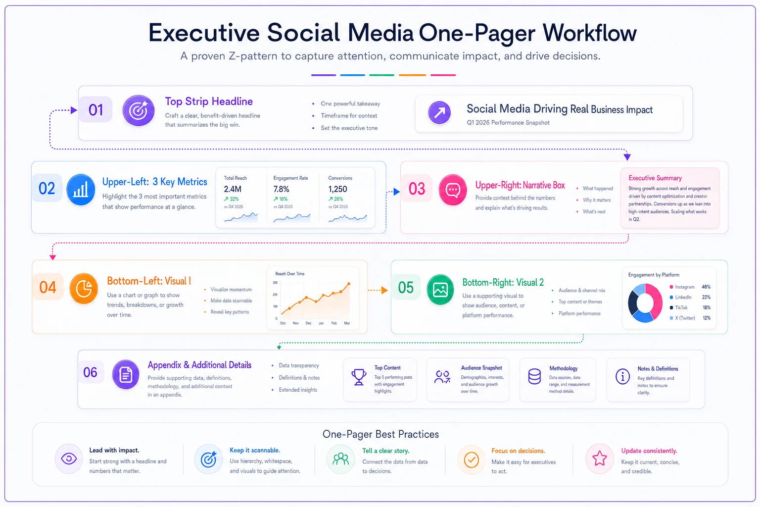
Layout matters more than people admit. The eye moves top-left to bottom-right in a rough Z. Put your most important thing where the eye lands first.
A one-pager that works usually breaks into four zones:
Top strip — the headline. One sentence, plain English. "Social drove roughly 140 qualified leads in October, up from ~95 in September, mostly from paid video." That's the whole month in a line. If someone reads only this, they should still walk away with the right picture.
Upper-left — three headline metrics. Big numbers, with the prior period next to each in small gray text. No more than three. The moment you add a fourth, the eye stops treating them as "the important ones."
Upper-right — the narrative box. Three to four sentences of the dominant story. This is the only prose on the page and it's what executives actually read.
Bottom half — two visuals max. One trend line showing your primary metric over 6–8 weeks so direction is obvious. One breakdown chart — by channel, content type, or funnel stage — that supports the narrative. Everything else goes in an appendix that nobody's obligated to open.
That's it. If it doesn't fit on one page at a readable font size, something on it isn't essential.
A quick note on visuals
The most common visual mistake is the stacked bar chart with eight segments and a legend. Nobody decodes that in 90 seconds. A single line for the trend and a simple horizontal bar for the breakdown, sorted largest to smallest, works far better. Color one bar to match the narrative — if your story is about video winning, make the video bar the only colored one and gray out the rest. The chart should argue your point before anyone reads the labels.
Color one bar to match the narrative — if your story is about video winning, make the video bar the only colored one and gray out the rest.
The eye moves top-left to bottom-right in a rough Z.
That's it. If it doesn't fit on one page at a readable font size, something on it isn't essential.
A real scenario
A mid-size DTC skincare brand had a two-person social team reporting to a founder who, by their own admission, "skimmed everything." Their monthly report was a 12-slide deck exported straight from their scheduling tool. Feedback from leadership was consistently vague — nods, occasional "looks good," rarely a real decision.
They switched to a one-pager. Headline metric at the top: social-attributed revenue, which came out to roughly $31k that month against about $26k the prior month. The narrative box was a growth slice explaining that the lift came almost entirely from a UGC-style video series, not the polished branded posts they'd historically prioritized.
The founder read it in the meeting — the whole thing, in front of everyone — and immediately reallocated budget toward more UGC production. That decision came out of a single page. The 12-slide deck had contained the same data the month before and produced nothing.
Within two months the one-pager was the format leadership asked for across other marketing channels too.
The monthly handoff checklist
The one-pager itself is only half the job. The handoff — how it moves from analyst to executive — is where reports quietly rot. Run through this before you send anything:
-
[ ] Reader confirmed. You know exactly who's reading this and which of the four metric priorities apply.
-
[ ] One dominant narrative chosen. Growth, risk, or opportunity — not a blend of all three.
-
[ ] Headline sentence passes the "only line read" test. If they read nothing else, they'd still be correct.
-
[ ] Exactly three headline metrics, each with a prior-period comparison.
-
[ ] Narrative box includes a mechanism, not just a result ("up 18% because...").
-
[ ] Every risk has a paired action. No naked bad news.
-
[ ] Two visuals max, one trend + one breakdown, sorted and color-coded to the story.
-
[ ] The ask is explicit. What decision or budget move do you want from this reader?
-
[ ] Appendix link for the curious, so detail-hungry readers have somewhere to go without cluttering page one.
The line most people forget is "the ask is explicit." A one-pager that reports but doesn't request is just prettier filing. The whole point is to move a decision.
A repeatable build process
Here's the order that actually works — which is deliberately not the order you present it:
-
Write the ask first. What do you want this executive to do or decide? Everything else serves this.
-
Pick the dominant narrative that supports the ask. Opportunity ask → opportunity slice.
-
Choose the three headline metrics that make the narrative undeniable.
-
Write the headline sentence last
compress the narrative into one line.
-
Build the two visuals to back the metrics, not to show off the dataset.
-
Cut everything else to an appendix and stop touching the page.
Building the ask first feels backwards, but it's the difference between a report that informs and one that moves money. When you start from the data and work forward, you end up with the 12-slide deck. When you start from the decision and work back, you end up with something an executive actually reads and acts on.
When a one-pager is the wrong call
It's not always the right format.
Skip it when the audience is your own team. Practitioners need the detail. A one-pager for the person who has to fix the underperforming ad set is actively unhelpful. Give them the full breakdown.
Skip it during a genuine crisis. If something is seriously broken — a compliance issue, a viral backlash — that's a conversation and a live document, not a monthly summary artifact.
Be careful in the first 60 days of a new program. Early on, you don't have enough trend data to tell a real story, and forcing a narrative onto three weeks of noise trains executives to distrust you. In that window, just be honest that you're still baselining.
For everyone else — the founder who skims, the CFO who wants efficiency, the CMO juggling six channels — the one-pager is the format that gets read. And getting read is the entire job. A report containing perfect analysis that nobody opens is worth exactly as much as no report at all.
The teams that make this work treat the one-pager as a decision tool, not a summary. They pick a reader, pick a story, surface three numbers, make one clear ask, and cut the rest. It takes less time to produce than the sprawling deck it replaces — and unlike the deck, it actually changes what happens next month.
Ready to amplify your brand’s voice?
Join 2,500+ marketers using Postyly to save time, boost engagement, and grow their audiences effectively.