



A Slack message that says "engagement is down 40% this week, looking into it" does two things. It scares your VP, and it teaches them nothing. By the time you've figured out the actual cause, someone in leadership has already invented their own story — usually the wrong one — and now you're fighting to correct a narrative instead of explaining what happened.
The gap isn't analysis. Most social managers can eventually figure out why a number moved. The gap is packaging that finding into something a non-technical exec reads in 90 seconds and walks away with the right conclusion. That's what a social incident narrative template is for: a fixed structure you drop numbers into so every performance surprise — good or bad — gets communicated the same clean way. Below are three templates tuned for the three situations that actually come up: a drop, a spike, and a neutral shift (numbers moved but it doesn't matter, and you need to say so before anyone panics). Each one comes with the stat slices worth pulling, a root-cause checklist, what the visual should look like, and how to end with a recommendation instead of a shrug.
Why "the number is down" is the wrong opening line
Execs don't think in metrics. They think in decisions and money. When you lead with "reach dropped 38%," you've handed them a raw fact with no frame, and the human brain fills empty frames with the scariest available explanation. Usually that's "we're losing the audience" or "the campaign failed."
A typical example: a mid-size DTC skincare brand saw Instagram reach fall about 45% over ten days. The real cause was a paused paid boosting line during a budget review — one that had been quietly inflating "organic-adjacent" reach in the platform's native reporting. Nothing was broken. But because the first message to leadership was just the scary percentage, the founder spent an entire meeting convinced the algorithm had "turned on them," and the team burned two days building a defensive deck.
The fix isn't better data. It's sequencing the story so the cause and the "so what" arrive at the same moment as the number. That's the whole job of these templates.
The shared skeleton (all three templates use this)
Every narrative — drop, spike, or neutral — uses the same five-beat structure. Consistency is the point. When execs see the same shape every time, they stop reading defensively and start reading for the decision.
Stop managing your social media the hard way.
Postyly helps you plan, schedule, and analyze every post with precision.
- Multi-platform scheduling
- Real-time engagement tracking
- Automated performance reports
No credit card required
-
Headline in plain English — one sentence, no jargon, includes the "so what."
-
What moved — the specific metric, the size of the move, the window.
-
Why (most likely) — ranked causes with a confidence level, not a single guess.
-
What it costs or earns — dollars, pipeline, or "nothing material," stated explicitly.
-
Recommendation — one thing you want them to approve, ignore, or wait on.
The mistake most people make is spending 80% of their effort on beat #2 (the pretty chart) and almost none on beats #4 and #5, which are the only parts an exec actually needs. Flip that ratio.
A quick visual to show the five-beat sequence.
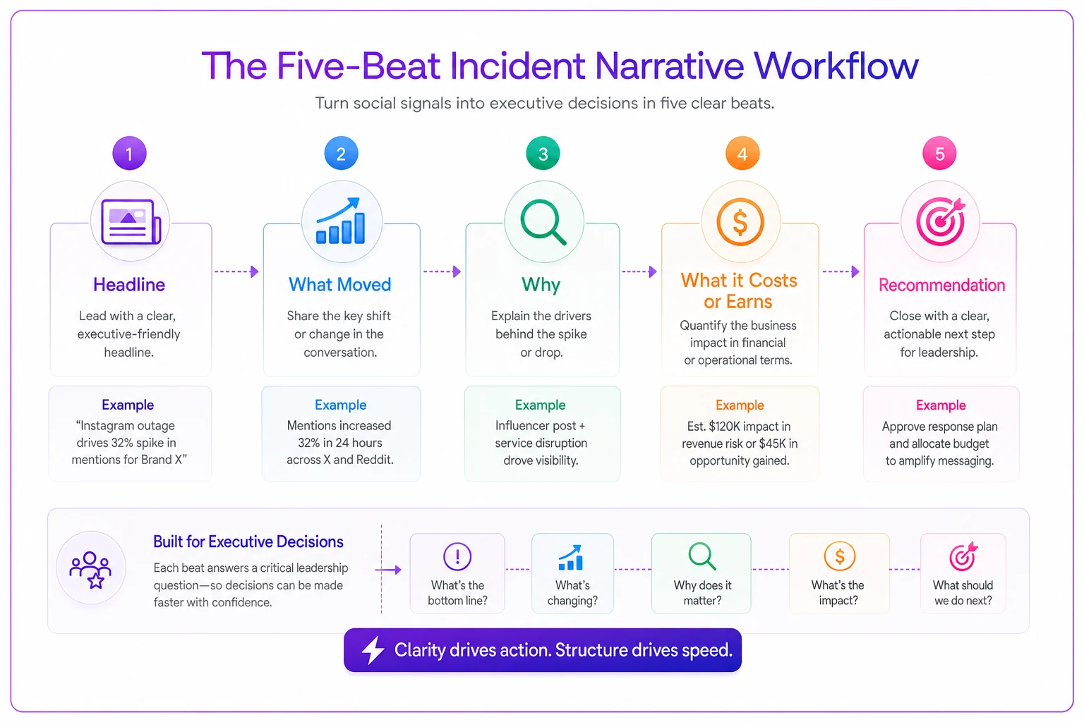
This layout emphasizes sequencing so cause and recommendation arrive with the number.
Template 1: The Drop Narrative
Stat slices worth pulling for a drop
-
The metric, split by paid vs. organic. Half of all "drops" are one channel moving while the other holds steady.
-
Week-over-week AND same-period-last-year. A 30% drop from last week can be a 5% gain year over year if last week was an anomaly.
-
Reach vs. engagement rate. Fewer people seeing content is a distribution problem. Same reach but worse engagement is a content problem. Completely different fixes.
-
Top 3 declining posts by absolute loss, not percentage. A post that went from 50k to 20k matters more than one that went from 100 to 20.
-
Publishing volume. Genuinely obvious and genuinely missed constantly — you posted 40% less, so of course totals dropped.
Root-cause checklist for a drop
-
[ ] Did publishing volume or cadence change? (most common, least blamed)
-
[ ] Did a paid line item get paused, capped, or reallocated?
-
[ ] Is a tracking or tagging change hiding reach that's still happening?
-
[ ] Did one previously viral post roll out of the reporting window?
-
[ ] Format mix shift — did you swap video-heavy weeks for static?
-
[ ] Platform-side change (feature deprecation, ranking update)?
-
[ ] Genuine audience/content fatigue (last, because it's the rarest and most over-blamed)
The pattern worth internalizing: operational and measurement causes are far more common than "the content got worse." Yet content is what people instinctively blame, because it feels like the thing they control. Check the boring stuff first.
Run the root-cause checklist before drafting the headline.
What the visual should show
One chart. A line graph of the affected metric with the drop window shaded, plus a single annotation arrow pointing at the cause ("paid paused here"). Do not send a 12-panel dashboard. If leadership can't find the story without you narrating it, the visual failed.
How the drop narrative reads (filled in)
> Headline: Organic reach fell ~38% over the last 10 days because we paused a paid boosting line during budget review — this is expected, not a content problem. > What moved: IG organic reach down ~38% WoW; engagement rate flat. > Why: (High confidence) Paused paid support that inflated native reach numbers. (Low) No ranking or content signal of decline. > Cost: None material. The reach we "lost" was paid-attributable and paused deliberately. > Recommendation: Resume the boosting line, or accept the lower baseline. No emergency action needed.
Template 2: The Spike Narrative
People think spikes don't need explaining. They do — arguably more. An unexplained spike sets a baseline expectation you can't sustain, and next month's return-to-normal gets reported as a drop. You end up apologizing for a good month.
Stat slices worth pulling for a spike
-
Single-post concentration. What share of the spike came from one post? If 80% of the gain is one video, that's a lucky hit, not a trend.
-
New vs. returning audience. A spike from new reach is a discovery event. A spike from your existing audience is engagement depth. Different implications entirely.
-
Follower conversion. Big reach with flat follower growth means it traveled but didn't stick.
-
Downstream action (link clicks, saves, profile visits) — did the spike do anything commercially, or was it vanity?
Root-cause checklist for a spike
-
[ ] Did one post go outside its normal reach band? (isolate it)
-
[ ] External event — press mention, influencer share, trend participation?
-
[ ] Paid injection you might be attributing to organic?
-
[ ] A format or hook you can deliberately repeat?
-
[ ] Timing luck (posted into a low-competition window)?
The honest observation here: most spikes are not repeatable, and the professional move is saying so. Leadership respects "this was one great post, here's what we learned and here's why I don't expect a repeat next week" far more than implied credit for luck. The spikes that are repeatable — a hook or format that worked — should feed straight into your testing pipeline rather than living as a one-off war story. If you're logging those learnings properly, they belong in a structured experiment catalog with metadata rules and significance thresholds so a lucky hit becomes a testable hypothesis instead of folklore.
What the visual should show
Same clean line chart, but here the annotation calls out the single driver and a dotted line showing your normal baseline — so it's visually obvious this is above trend and where "normal" sits. That dotted baseline is what prevents the future "why did we drop" conversation.
Template 3: The Neutral Narrative
The most underused of the three, and the one that quietly saves the most time. Numbers moved — maybe 10–15% either direction — but the movement is noise, seasonality, or reporting timing. The neutral narrative exists to stop an investigation before it starts.
When a movement is actually neutral
| Signal | Likely neutral | Worth investigating |
|---|---|---|
| Size of move | Within ~15% of normal variance | Outside your usual weekly swing |
| Duration | 1–3 days | Sustained 7+ days |
| Breadth | One metric wobbles, rest hold | Multiple metrics move together |
| Known cause | Fewer posts, holiday, timing shift | No obvious operational cause |
| Downstream | Clicks/conversions steady | Commercial metrics also moving |
If most of a movement lands in the left column, you don't have an incident. You have weather. Say that clearly.
The neutral narrative reads short — on purpose
> Headline: Engagement dipped ~12% this week due to a lighter posting schedule around the holiday. No action needed. > What moved: Engagement down ~12% WoW; reach and conversions flat. > Why: Posted 5 times vs. usual 8. Normal seasonal cadence. > Cost: None. > Recommendation: None. Flagging so nobody reads the dip as a trend.
The one-decision rule for every narrative
Whatever template you use, end on exactly one ask. Not three options, not a menu — one recommended action with the reasoning attached. Execs are approving or declining, not designing the fix. When you present five possibilities, you've handed the strategic work back to someone with less context than you, and the meeting expands to fill the ambiguity.
If you genuinely have multiple paths, state your recommendation first, then list alternatives beneath it as fallbacks. "I recommend X. If budget's frozen, Y is the next best." Structure the choice; don't outsource it.
This same discipline is why the narrative fits naturally alongside a standing executive one-pager for social performance — the one-pager is your steady-state report, and the incident narrative is what you drop in when something moves enough to need its own explanation.
A real scenario: the "failing" quarter that wasn't
A regional home-goods retailer with a small in-house social team walked into a quarterly review certain they were about to get grilled. Engagement was down roughly 25% quarter over quarter, and the CMO had already flagged it as a concern in an email.
The team almost led with the drop. Instead they built a drop narrative and ran the checklist first. Two things surfaced: they'd cut posting from about 12 posts a week to 8 during a hiring gap, and the prior quarter had included a single seasonal post that pulled close to 300k reach — a genuine outlier now rolled out of the comparison window.
Reframed, the story became: "Engagement per post is up slightly. Total engagement fell because we posted about a third less and lost one outlier post from last quarter's comparison. Recommendation: refill the open role and we return to baseline within a month." Same numbers. Completely different meeting. The CMO approved the backfill instead of ordering a strategy overhaul, and the team saved themselves weeks of reactive "prove the content still works" busywork.
The lesson isn't that the numbers were fine — it's that raw numbers and their story arrived together, so nobody had time to invent a worse version.
When these templates are overkill
Not every wobble deserves a written narrative. If a metric moves inside its normal weekly variance and no one's asked, logging it internally is enough — publishing a formal narrative for every 8% swing trains leadership to expect drama and buries the reports that actually matter.
Use a full narrative when: the move is outside normal variance, when leadership has already noticed, when money or budget is attached, or when a decision depends on the explanation. Everything else is a line in your internal notes, not a stakeholder document.
One thing worth not skipping, though: the neutral narrative. Silence gets interpreted. If reach visibly dropped and you say nothing, leadership assumes you either didn't notice or don't have an answer. A two-line "this is noise, no action" note is cheap insurance against a narrative you didn't write yourself.
Putting it into rotation
Save the three templates as fill-in-the-blank blocks somewhere your whole team can grab them — the point is that anyone can produce a consistent narrative in ten minutes, not just your best writer.
The structure carries the quality so the person doesn't have to.
The deeper shift is cultural. Once leadership sees that every performance surprise comes back in the same calm, five-beat shape — cause, cost, one clear ask — they stop treating dashboard movement as an emergency and start treating it as information. That's when you get to spend your time on the work instead of defending it. A performance drop will always feel urgent in the moment; a good narrative is just the difference between reacting to the number and explaining it before anyone else has to guess.
Ready to amplify your brand’s voice?
Join 2,500+ marketers using Postyly to save time, boost engagement, and grow their audiences effectively.